In-File UX Documentation
In-file, UX documentation is a layer of information that isn’t part of the design itself but helps everyone to understand it better.
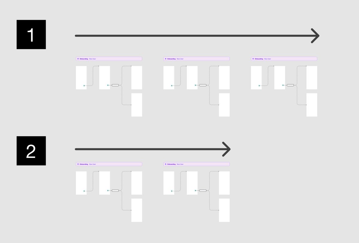
In-file, UX documentation is a layer of information that isn’t part of the design itself but helps everyone to understand it better.
The benefits of great UX documentation are too good to ignore
- It provides "Organizational memory". Especially in larger teams, folks end up solving the same problem multiple times, repeating mistakes, and not really learning from them
- It helps new hires get up to speed. Making them more productive more quickly, and helping them integrate faster into the team
- It generates greater autonomy among design and dev. People can refer to the documentation instead of spending a week booking Zoom calls with multiple stakeholders
What UX documentation shouldn't be
UX documentation shouldn't be 300 pages long PDFs.

You shouldn't spend your time writing a long and boring document nobody will have the patience to read.
Instead, make sure your in-file UX documentation is
- Easy to Read
- Easy to Understand
- Easy to Maintain.
Think of it as, making files read like comic books.
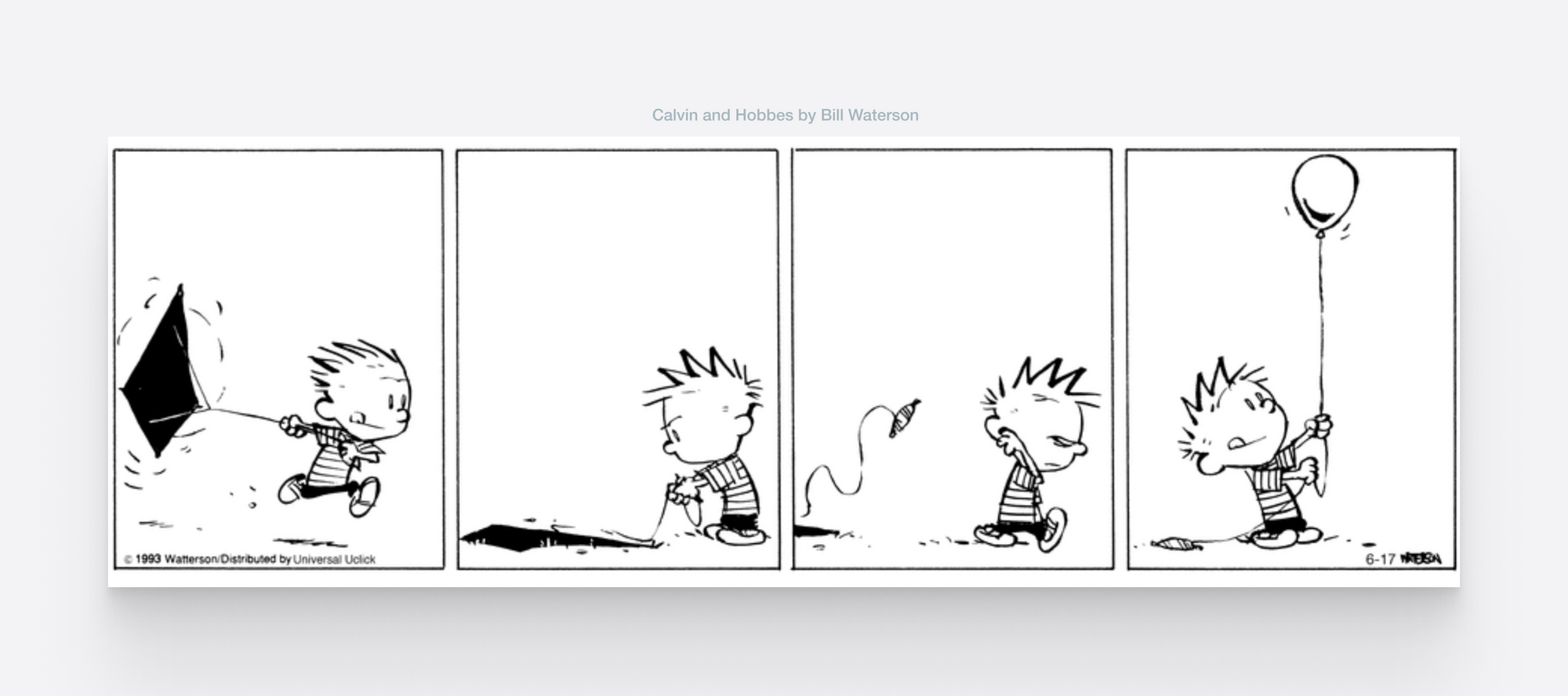
Comic strips use time-tested, communication principles, such as visual artifacts —speech bubbles— sequencing, and grouping, to get their message across.
You can apply these techniques to your design files to make them easy to read, understand, and maintain.
1. Use presentation artifacts
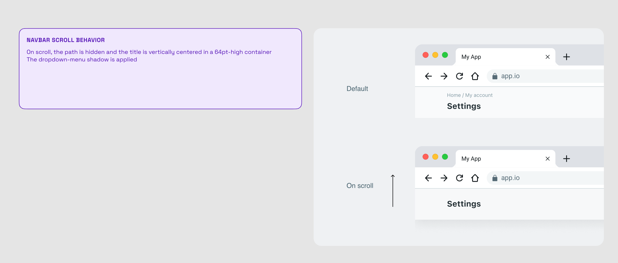
These are components that are not part of the design but help communicate what's happening.
They could be
- Notes and comments
- Big titles for sections
- Arrows and ribbons for flows
- Cursors
- OS mockups such as push notifications
- And more
It's a good idea to treat these as a shared library of components to keep consistency and make them easier to maintain.
You can find a lot of free resources in Figma's community or just by doing some google searches.
2. Provide context
In general, make sure each design file answers the following questions:
- What is the problem that this solves?
- What has been tried before? (state of the art)
- Would the HR intern understand what this is about?
These will give readers and stakeholders who might not be in the loop, the context they need to understand the design.
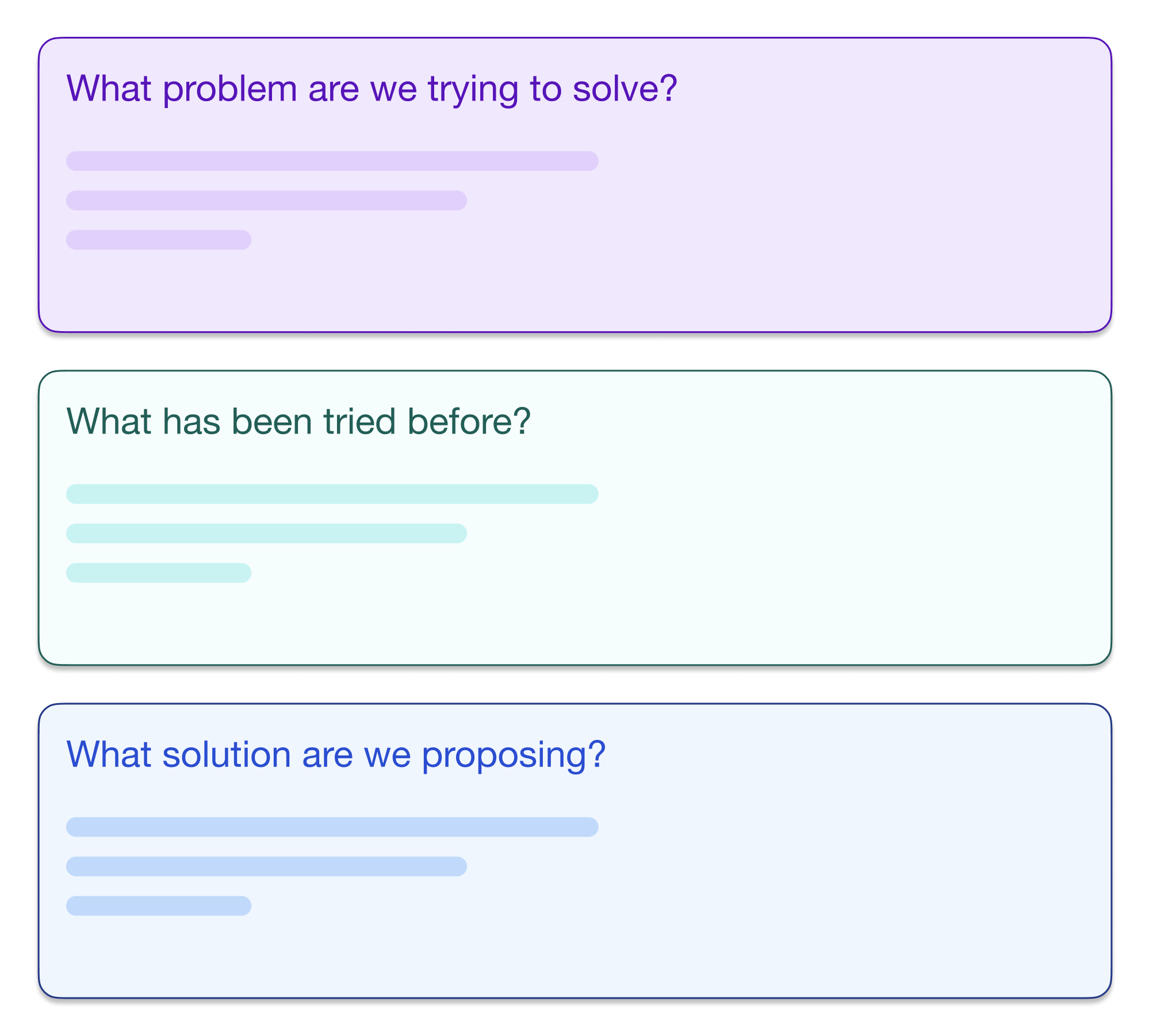
Ideally, put the answer to these questions at the top of the file as a summary.
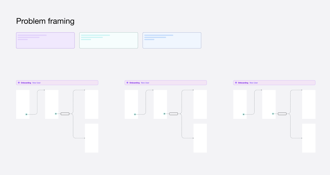
3. Group and sequence
As a designer, you should be aware of the importance of the Law of Proximity and the Law of Common Region, and the F-shaped Reading Pattern
Our recent eyetracking research shows that the F-shaped scanning pattern is alive and well in today’s world — both on desktop and on mobile. A typical example of the longevity of UX findings which depend more on human behavior than on technology. — NNGroups
To implement these principles in your design files
- Follow a natural reading pattern* — position your artboards and flows in a logical order, knowing they'll be generally read from top to bottom, and from left to right.
- Serialize — use some form of serial numbers for artboards when possible. This reinforces sequence and helps readers understand where in the flow they are. Figma makes this easy by selecting multiple artboards and pressing
CmdR - Organize by groups — Clearly identify artboards belonging to the same flow. You can use Figma's
ShiftSto create sections or use an artifact like a ribbon.
*The natural reading pattern is a function of localization. Many languages follow a right-to-left pattern.
Do you use any other techniques I didn't cover here? Let me know and I'll include it with a mention to you ✌️