Why put dots in a virtual canvas
Why is it such a common design decision to use dotted canvases? And what is a digital canvas anyway?

Miro and FigJam, two of the most popular whiteboarding tools, have dots in their background.
These dots get closer or farther from each other depending on your level of zoom.
Why is it such a common design decision to use dotted canvases? And what is a digital canvas anyway?
What are digital canvases?
Digital canvases are user interfaces where you can place objects in relative positions and sizes. They are usually large in terms of pixels, so, most times, you can only see a small portion of them.

Properties of objects
Objects placed on a digital canvas have four properties to them.
- Position on the X axis
- Position on the Y axis.
- Position on the Z axis, i.e., what appears on top of what.
- Scale
Blank canvas disorientation: The problem with blank canvases
On a blank digital canvas, it's hard for our brain to understand the X, Y, Z, and scale properties of an object. Depending on the case, this can be problematic.
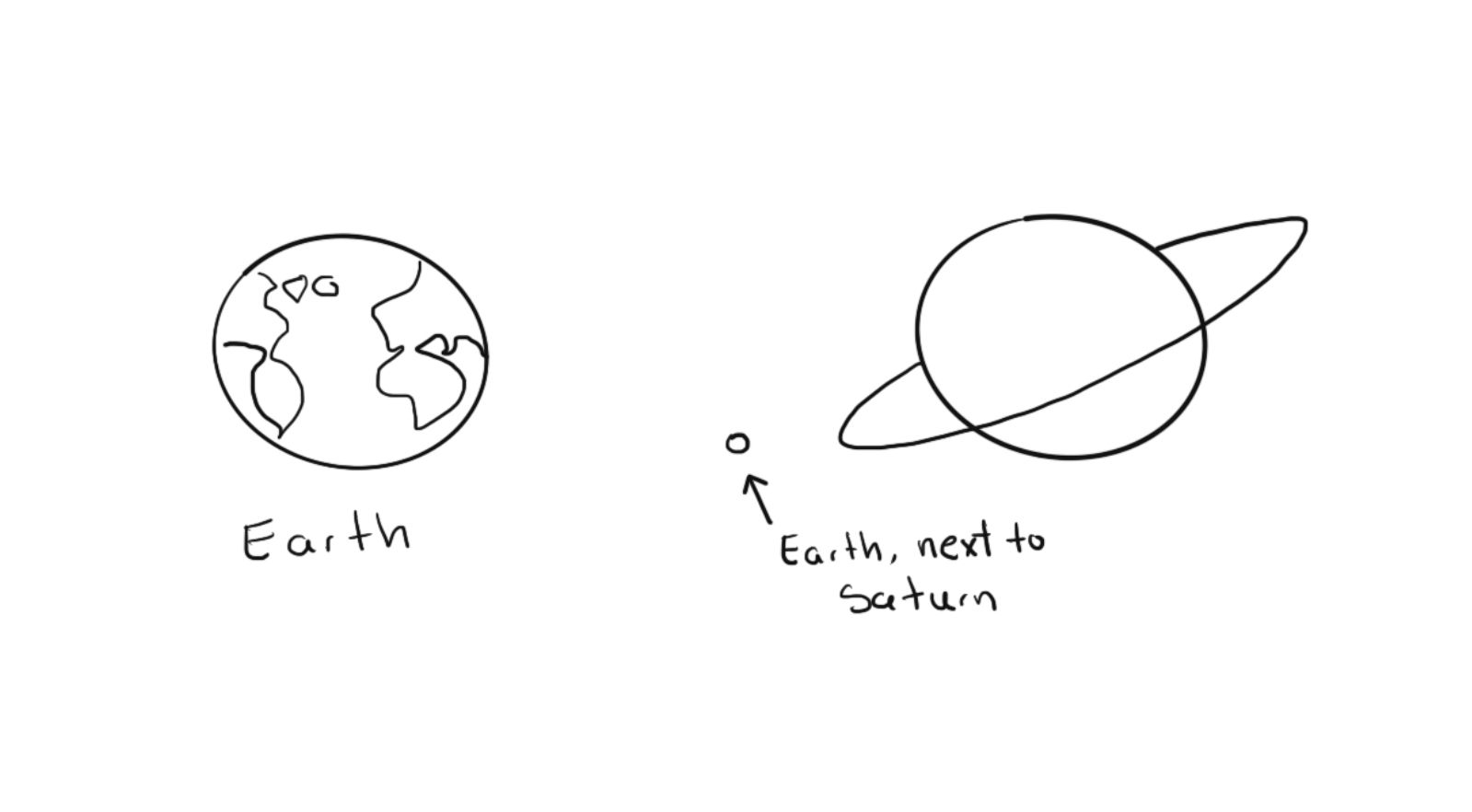
Our brain seems to process the world in terms of contrast. Without context, it's usually difficult for us to decide if an object is small or large.
This is evident when looking at pictures or 3D models of planets.
Imagine you're working on a canvas, and you place two objects 10 000 pixels away from each other.
At zoom 0, or 1:1 scale, 1 pixel in the canvas = 1 pixel in your display (4 in a retina display, but let's stick to 1 px for simplicity). To go from object A to object B, you'll have to pan at least three times.
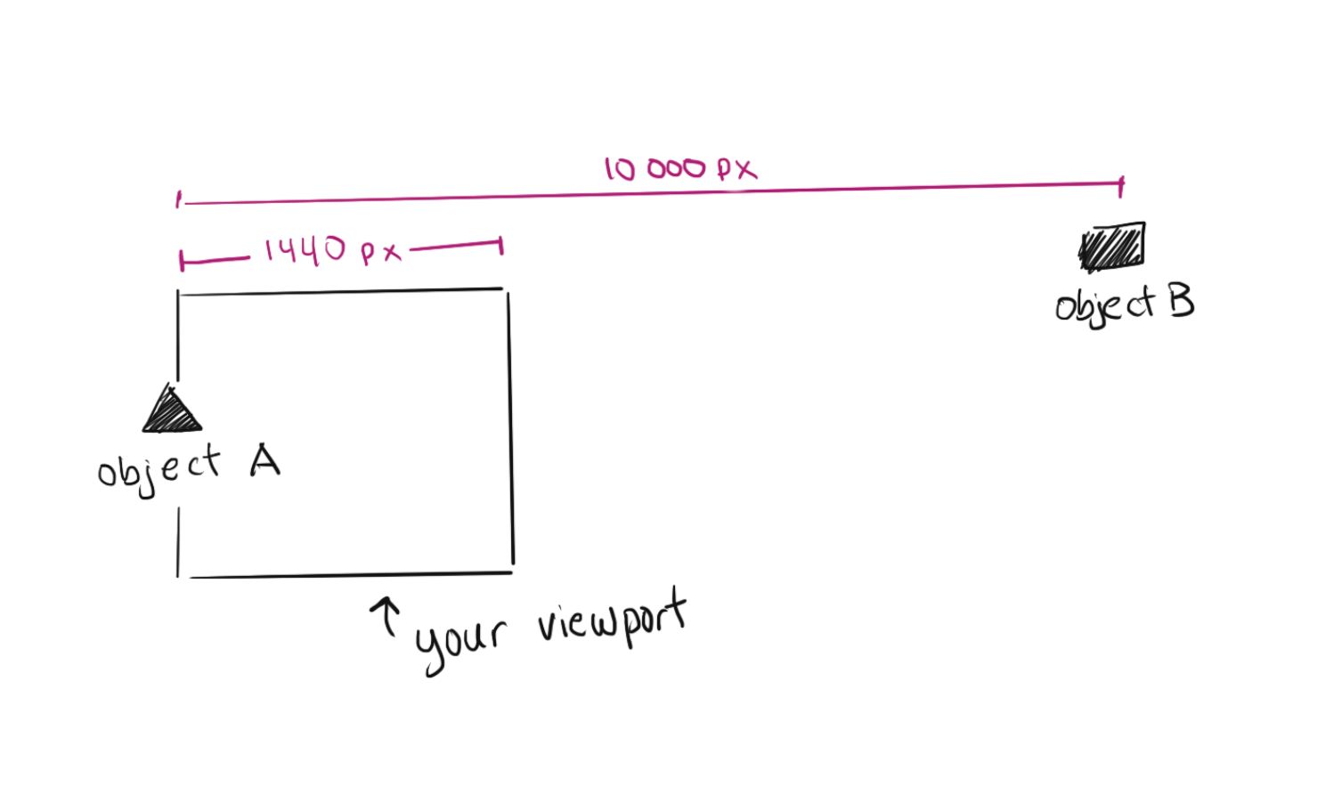
That takes enough time for your brain to get disoriented and mildly annoyed.
It's not a big deal, you say? If you're working on a file for a couple of hours, those disorienting milliseconds quickly compound and make for a much less enjoyable experience.
The dotted canvas
It seems trivial, but when you think about it, a dotted canvas is one of the most efficient ways in which you can solve the problem of blank canvas disorientation.
A dot is the simplest object there is. Nothing is less obstructive than a dot except the absolute void.
A dot grid is, therefore, the least obstructive way of providing visual cues for position and scale.
Now, I can't possibly know whether all the designers at these companies chose a dotted canvas for this exact reason. But they could have tested other options that would have led to a similar conclusion.
Alternatives to the dotted canvas
Y'all must remember from school days that notebooks —and I'm talking about physical, paper notebooks here— come with different grid layouts and are usually meant for different types of studies.
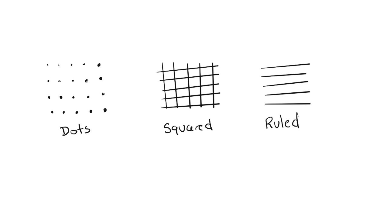
A squared grid, for instance, is used for math. A ruled grid is used for writing.
It's difficult, especially for children, to write in an organized way without these guides. So why didn't all these digital canvas tools go for a ruled or a squared grid then?
I believe the reason is a combination of two factors: Scale and noise.
Digital vs. physical cues
In the physical world, your brain takes cues for X, Y, Z axes and scales from an infinity of other elements.
There's the size of the page, the size of your hand, and our own stereopsis —our brain's ability to perceive depth through our binocular (two-eyed) vision.
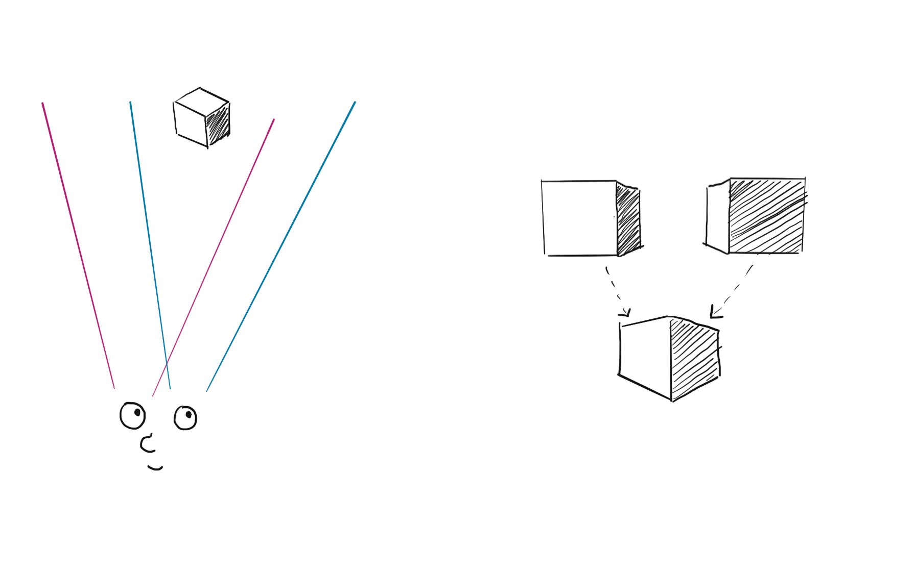
Apart from that, our brain takes distance cues from the appearance of objects. Colors seem to fade away as a function of distance.

These cues are completely absent in digital canvases, so we must represent scale with pixel size and white space. And that's extremely limiting.
When you zoom in, the lines in the grid become quite big. When you zoom out, they concentrate, creating a very noisy interface.
Digital displays don't have an infinite resolution, so there's a physical limit to how small something can be rendered.
Conclusion
The dotted grid seems to be the most optimal solution for representing the scale and position of objects in digital canvases. They are less noisy than other types of grids while retaining their referencing properties.
Boy, did I go down a rabbit hole here.