Designing blended tags in dark mode
Because of how displays work, things need higher saturation of color against light backgrounds and lower saturation against dark ones.
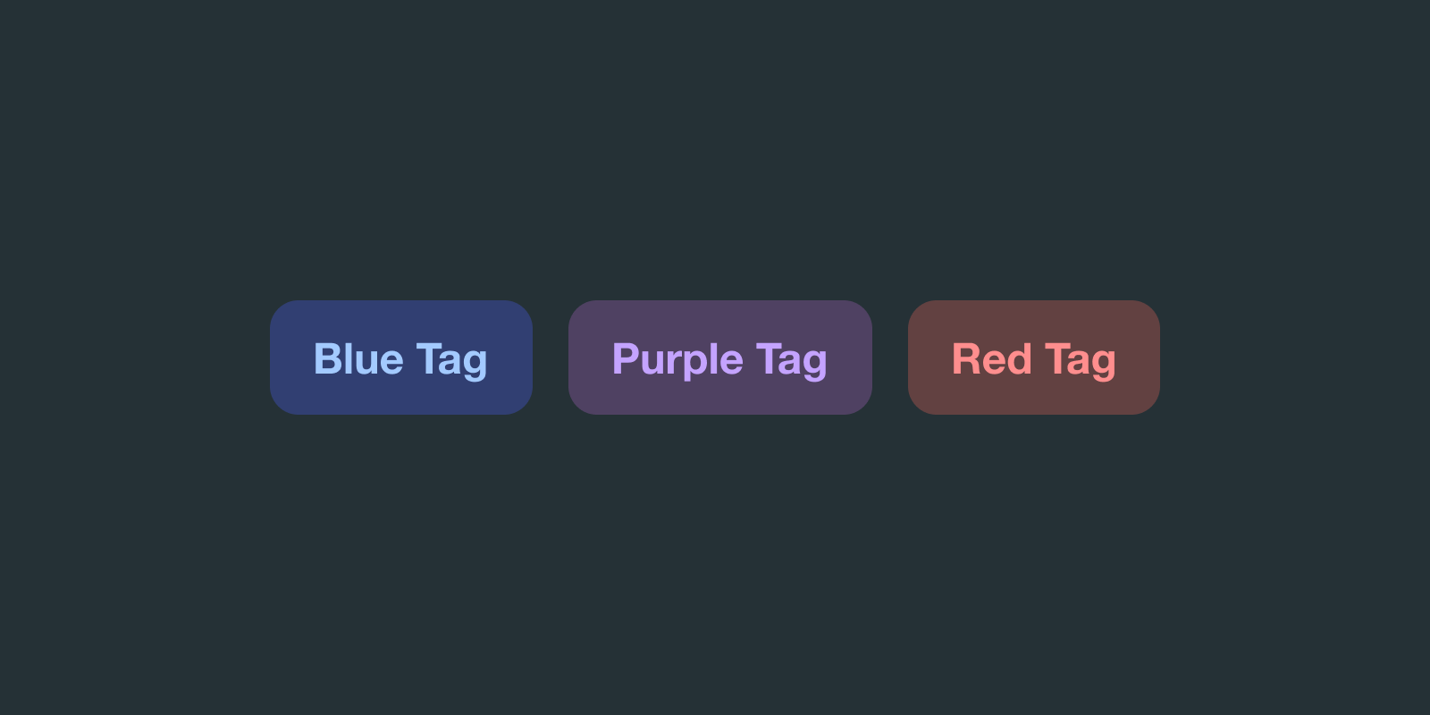
Update 9 February 2023 — Just a few hours after publishing this post, I came across this fantastic article by Dan Hollick, digging into the intricacies of good contrast in dark mode themes. Definitely recommened you check it out.
I was looking recently working on converting a set of blended tags to dark mode.
Turns out, it's not as straightforward as one might think.
You can't really leave them the same color. You could get away with not converting a main CTA, but not the tags — they stand out too much.
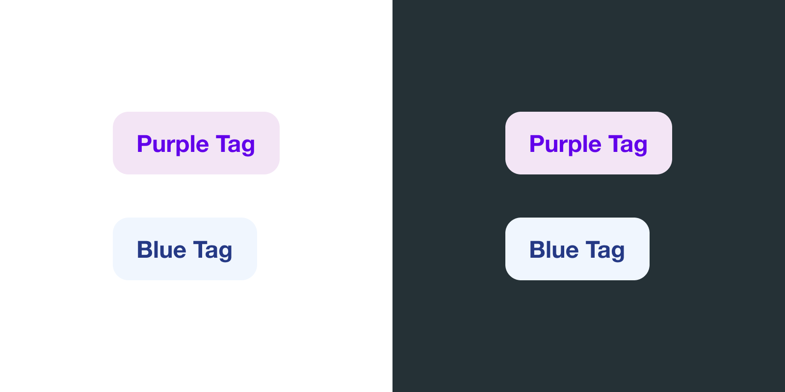
So the natural thing to try would be to make them darker, right?
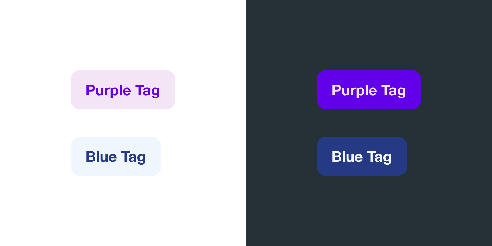
The thing is, you can't just make them darker to fit the dark theme because either they:
- a) Will have a really bad contrast ratio against the background, making them hard to read the text.
- b) Will look too saturated, which doesn't look good. Not in all color schemes at least.
After experimenting with different options and doing some reading online, I discovered some interesting things.
You see, our eyes distinguish shapes through contrast. Since monitors are essentially a flat grid of pixels, a lot of our perception depends on color contrast.
We can generally define color contrast as the chromatic distance between two colors. The further the distance, the higher the contrast.
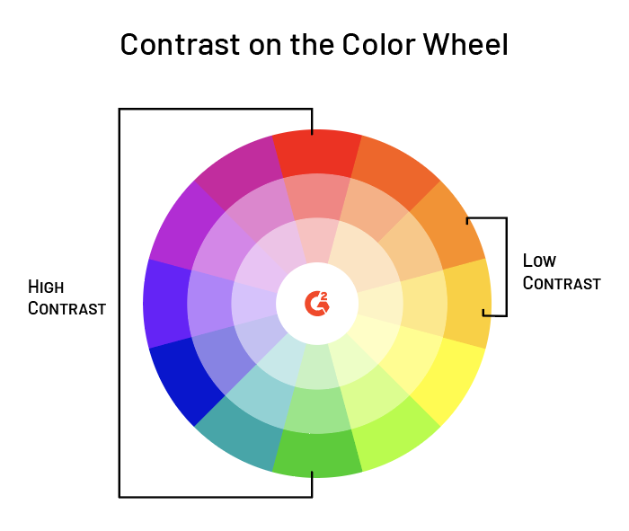
As you make saturated colors darker, they'll get chromatically closer to your background, which doesn't look great.
The solution? Slightly desaturated colors.
Turning down the saturation
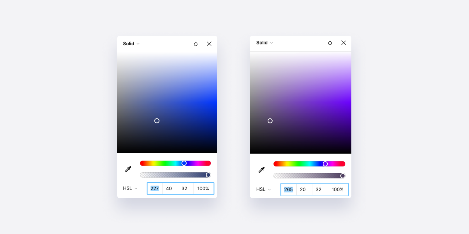
If you're working with the HSL color picker instead of the HEX this is really easy to do.
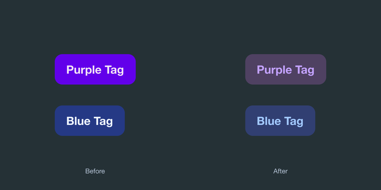
When you lower the saturation, you'll realize you can get away with darker colors without losing contrast, which allows you to nail that sort of transparent look of the blended tags.
Because of how displays work, things need higher saturation of color against light backgrounds and lower saturation against dark ones.
Here are a couple of screenshots of how I achieved the colors above.
You can use the same principle for blended icons as well.

You can also play around with the brightness and saturation of icons or text inside to achieve some interesting results.

Further reading
- Color Contrast: For the Sake of Aesthetic and Accessibility
- Icons are the Badass Icons from Samrat Chowdhury
- My article on Contrast and human perception