Balancing Cognitive Load and Discoverability
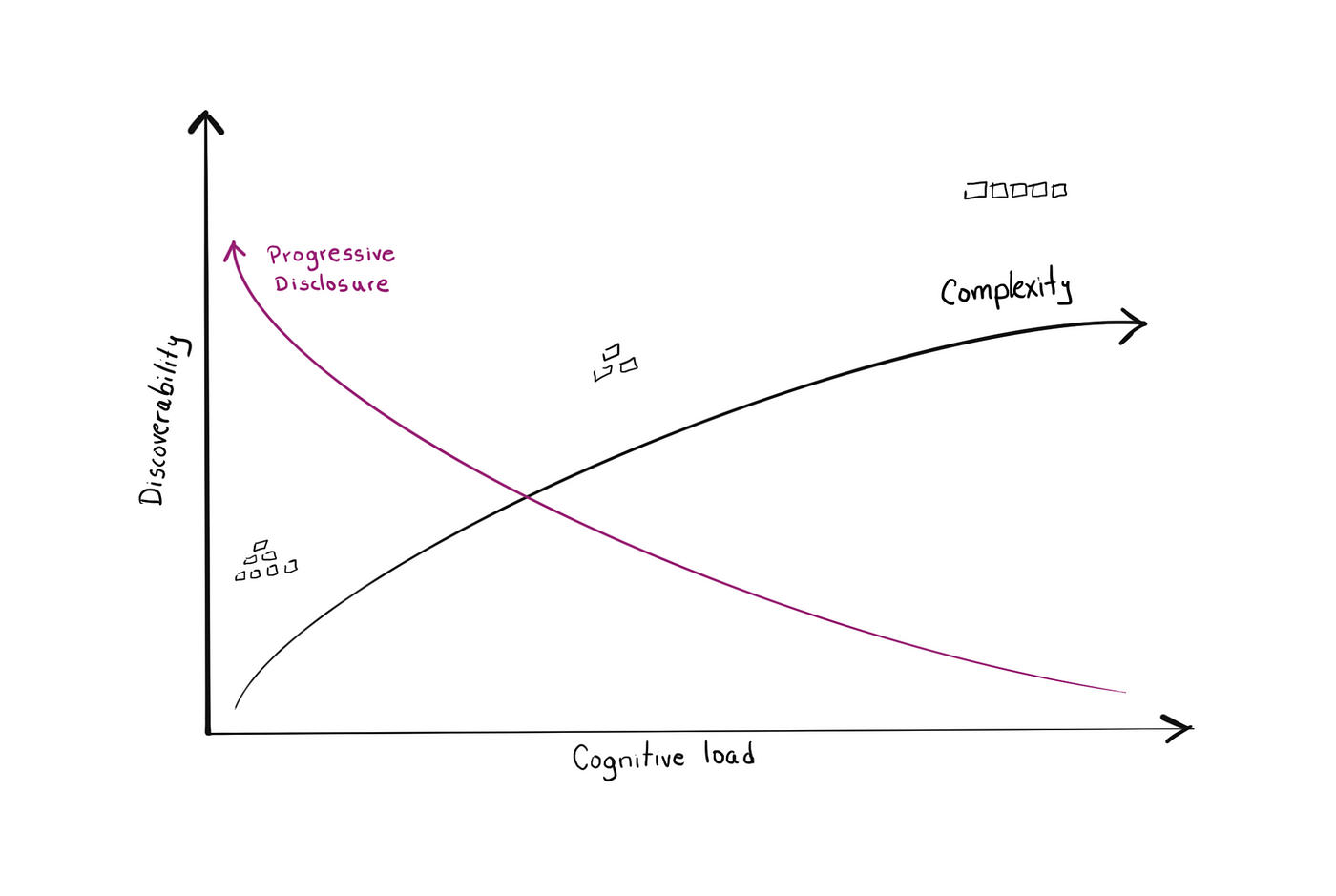
When we're designing an app's information architecture, whether we're aware of it or now, we're trying to draw a line between discoverability of options and cognitive load.
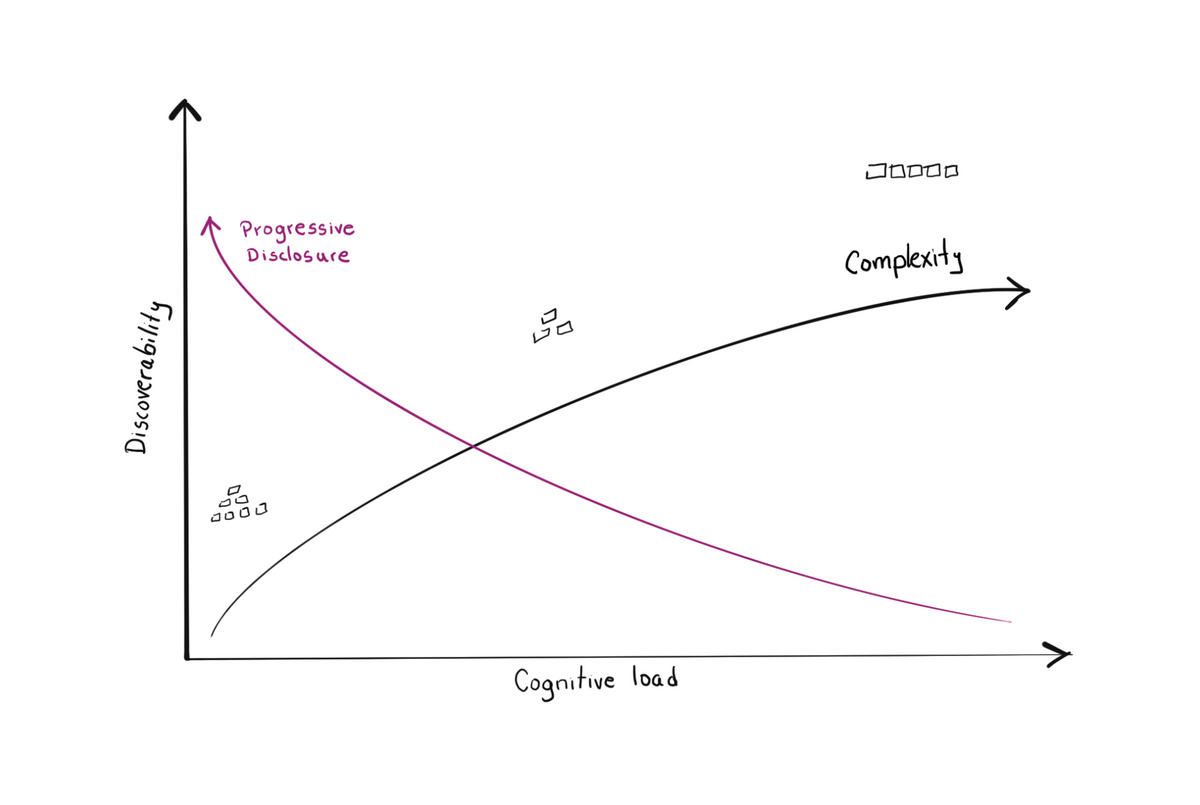
When we’re designing an app’s information architecture, whether we’re aware of it or now, we draw a line between the discoverability of options and cognitive load.
In order words, we’re thinking about the information density of the product.
Less is usually more
I’ve spoken about reducing cognitive load in the past and how it helps user interfaces seem easier to use.
Yet, as with all things in life though, focusing exclusively on reducing the number of options comes with a tradeoff.
Keeping cognitive load to a minimum can get in the way of discoverability.
Information Architecture & Cognitive Load
An abundance of options demands higher mental effort and is traditionally regarded as bad design.
High cognitive load comes primarily from a high number of options arranged in a flat-hierarchy architecture, also commonly known as index page architecture.
It’s one of the most common information architecture patterns on the web.
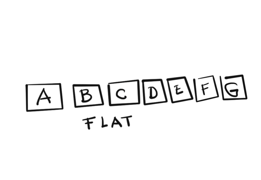
Taken to an extreme, can result in things like the overwhelming interfaces from the 90s and early 2000s.

Low cognitive load is typically achieved by hiding away non-essential information, which results in one of the various types of staggered-hierarchy architecture.
Examples of staggered architecture are:
A lot has been written about these types of architecture. Feel free to review the links at the bottom of the article to learn more.
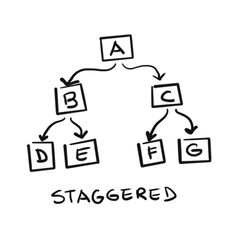
Staggered vs Flat Information Hierarchies
Let’s take a look at the two architectural approaches and their tradeoffs more in detail.
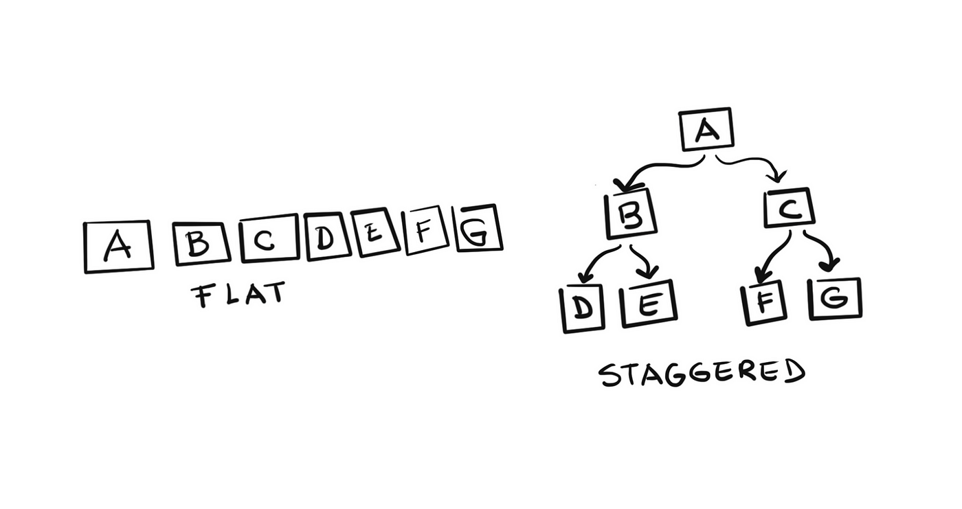
The case for a flat hierarchy
If we go for a completely flat hierarchy we risk overwhelming the user with too many options.
Hick’s law dictates that too many options will impair the user’s ability to make a choice. It induces decision paralysis.
A flat hierarchy, however, exposes the user to many features as they lay bare. To an extent, it helps with discoverability as long as the amount of information doesn’t become overwhelming.
The case for a staggered hierarchy
If we minimize the number of options — through progressive disclosure techniques, for example — we reduce cognitive load. That’s good.
But a careless application of progressive disclosure techniques comes at a cost. It increases the number of layers in the architecture, making it more complex.
Multi-layered information architectures force the user to learn and remember under which menu each option might be.
Solution — What to do instead
Know thy customer
If you’ve been designing for a while this won’t surprise you at all. Knowing your customer can help you determine a couple of key things:
- How your customer reacts to varying levels of information density
- What elements in your product are most important to them
- Which navigation and organization patterns are they familiar with
Conclusion — When to use which
Understanding the type of customer your serving can help you determine the best approach.
Sophisticated users —with pre-existing, compatible conceptual models— may deal well with higher levels of information density.
A broader audience might benefit from higher levels of progressive disclosure to gradually ease them into greater numbers of options.
Regardless of your approach, make sure to spend time creating a hierarchy of information based on your user's workflows. Exercises such as card sorting can be useful for this.
Lastly, it's always smart to adhere to widely common patterns when possible. E.g. Changing my password should be under either “My Account” or “Settings”. Do not reinvent the wheel unless you have a good reason.
Balancing cognitive load and information density requires a lot of skill and deep knowledge of your customer but the rewards can more than make up for the extra effort ✌️
Further reading
- https://www.altexsoft.com/blog/uxdesign/information-architecture/
- https://www.webfx.com/blog/web-design/information-architecture-101-techniques-and-best-practices/
- https://uxplanet.org/information-architecture-effective-techniques-for-designers-3c993956b1e1
- https://www.usability.gov/what-and-why/information-architecture.html
- https://blog.tubikstudio.com/information-architecture-basics-for-designers/
- https://www.nngroup.com/articles/progressive-disclosure/
- http://edutechwiki.unige.ch/en/Information_architecture#Hub-and-spoke_.2F_Daisy